Responsive Image
ARN Responsive Image is a Vendix Free Elementor widget that shows one image and can swap it for a different file on tablets and phones. It scales the image without cropping or holds it in a fixed slot, and it arrives with a sample drawing of an aquarium reef tank.
Free · Images & Media · All widgets
Examples
Each example below is the same widget with a different Sizing behavior setting.
Proportional — no crop (recommended)
The image follows the width of its container and keeps its own proportions, so nothing is cut off.
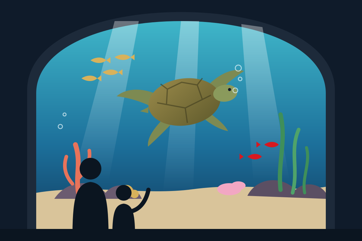
Fixed slot — fit entire image
The image sits in a slot of a set height, 560 px on desktop by default, and shrinks to fit so the whole image stays visible.
Fixed slot — fill and crop
The image fills the same slot completely and the parts that do not fit are cropped around the image focus point.
Settings
- Images per device: a desktop, tablet and mobile image. An empty tablet image falls back to the desktop image, and an empty mobile image to the tablet or desktop image.
- Alt text: your own alt text, or the alt text or title of the media library image when the field is empty.
- Slot height: 560, 440 and 320 px on desktop, tablet and phone for the fixed slot modes. On phones the slot follows the image ratio by default.
- Position: horizontal and vertical position inside the slot, offsets, image width and maximum width, and a horizontal and vertical image focus.
- Image style: opacity, rotation, horizontal and vertical flip, border radius, border and shadow.
- Layering and loading: visibility per device, a z-index layer, an option to ignore the mouse, a link, and lazy or eager loading.
Reviewed against Vendix Pro 1.13.0 · Last updated 21 October 2026