

SELF-SERVICE CARDS WITH A LIVE PREVIEW
Participant Experience
Cardix gives participants a page in Arabic, English or Turkish where they choose an event, type their details and see the card, either step by step on a light page or live on a dark page. They download, copy or share the finished card, and they choose whether their contact details may be kept.
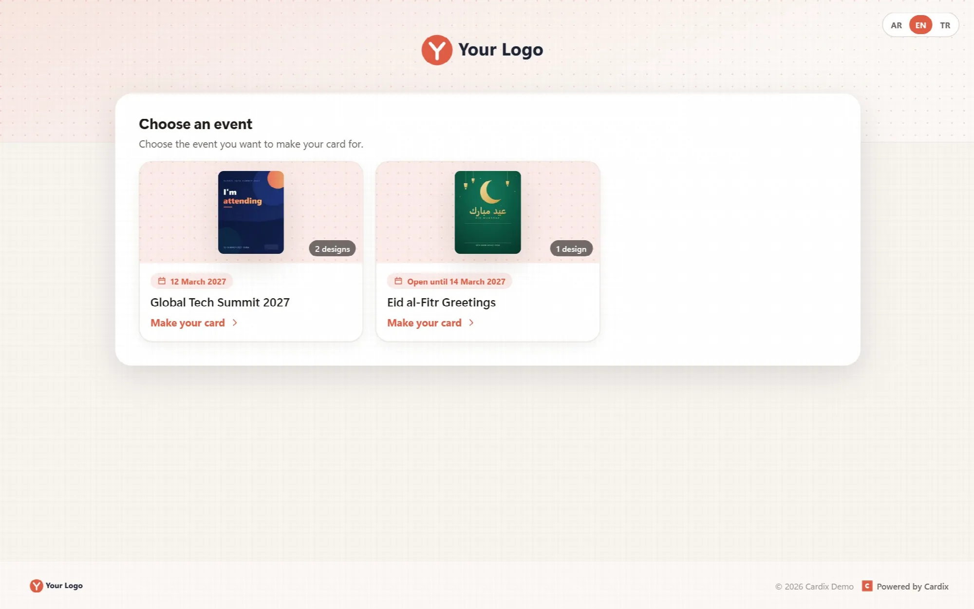
Event List
Show participants every open event at a glance.
The participant page is the home page of the installation. Open events appear as cards with a cover image (the first design), the number of designs and the event's date or the day it closes.
One event opens directly. If only one event is open, the page opens it without the list.
Event links. Each event also has its own link that opens its form directly.
Your brand around it. The top area shows your logo over your header image, or over a light pattern in the event's color. The footer shows the logo, your social links, the copyright and "Powered by Cardix".
No account. Participants do not register or sign in.
Invitations and card groups never appear in this list; they open only with their private links.
Bright & Night Appearances
Choose a quiet step-by-step page or a live card for each event.
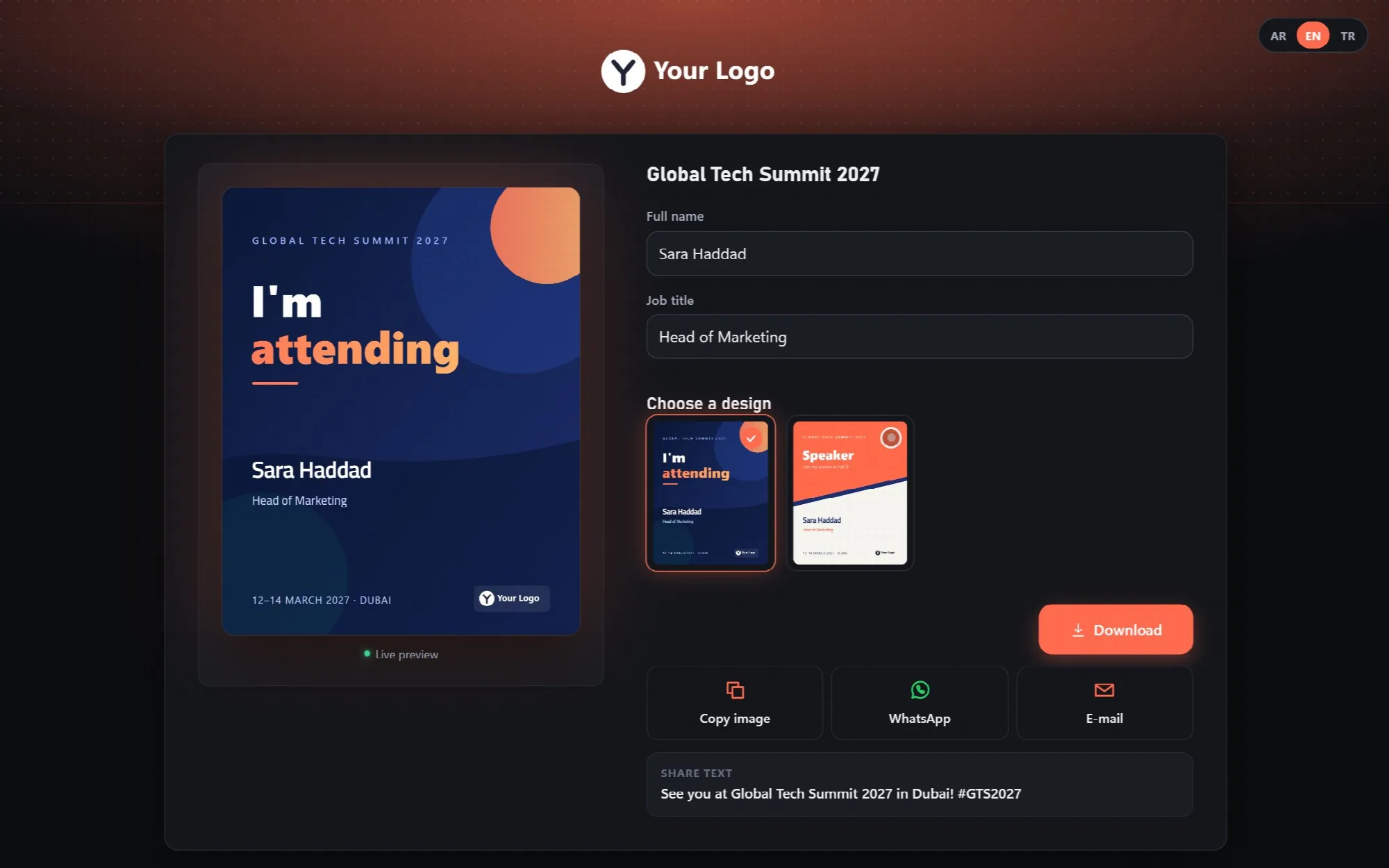
Each event chooses one of two appearances on its Participant page tab.
| Appearance | How it works |
|---|---|
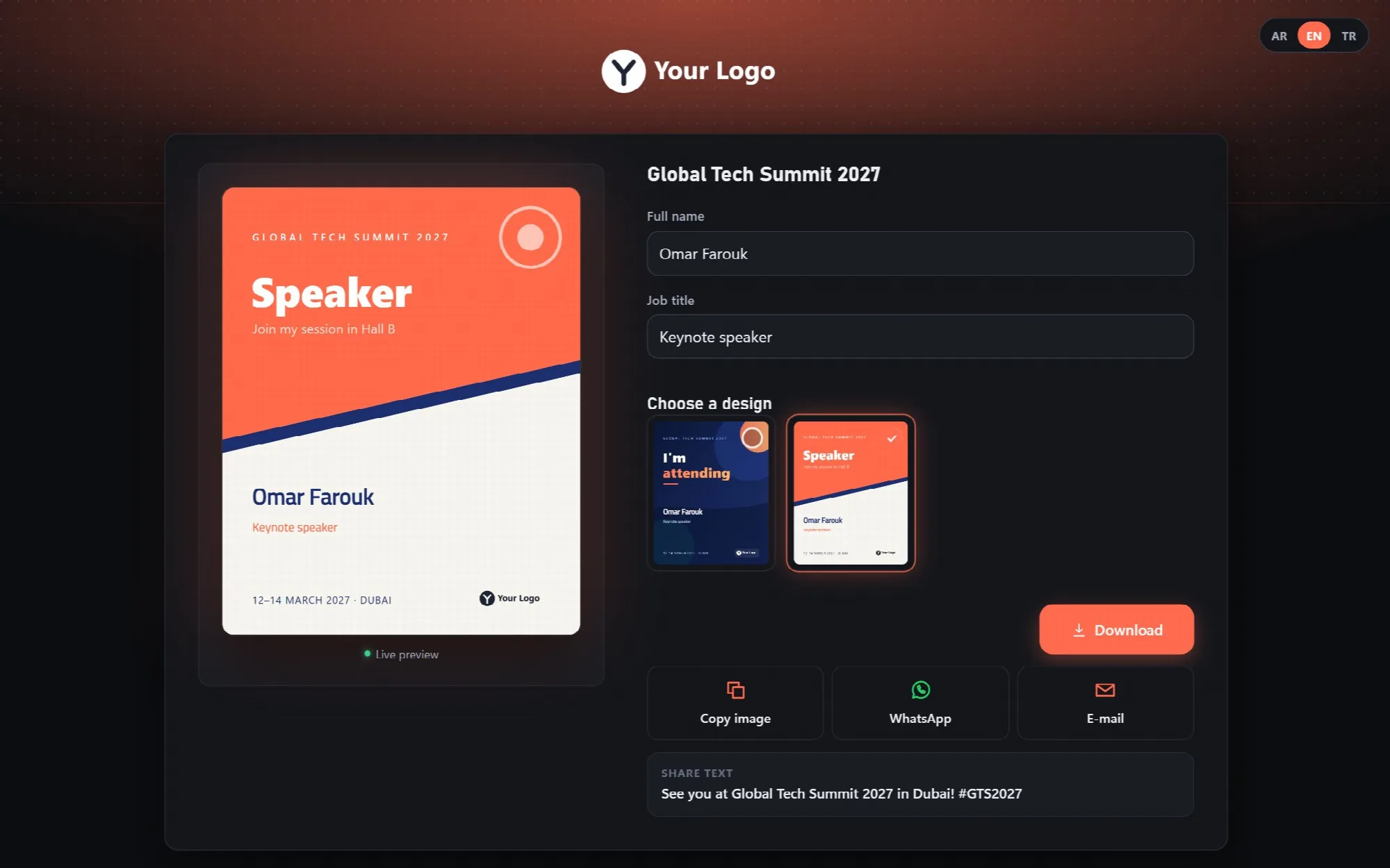
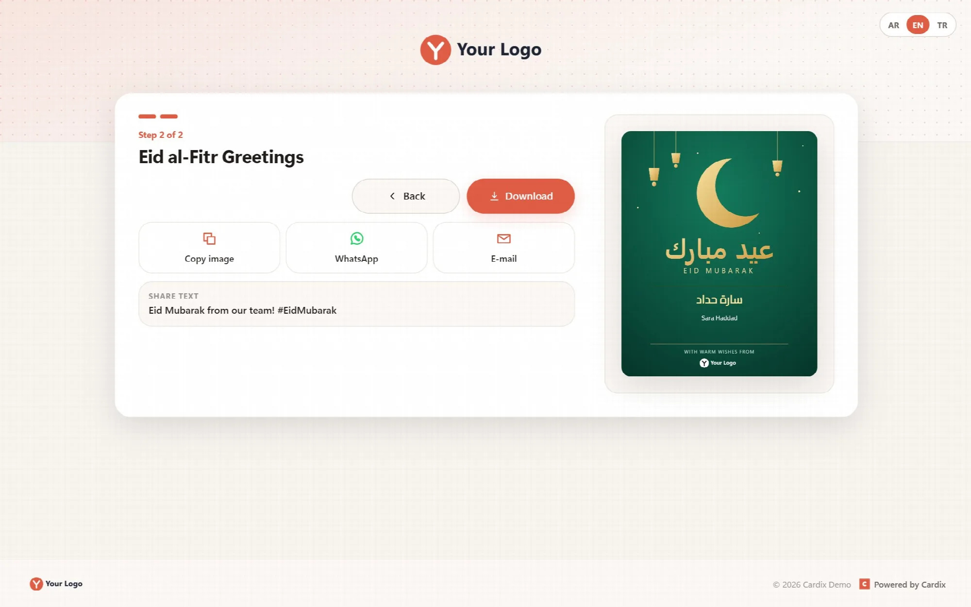
| Bright | Light page in two steps: the form, then the card with the download and sharing buttons |
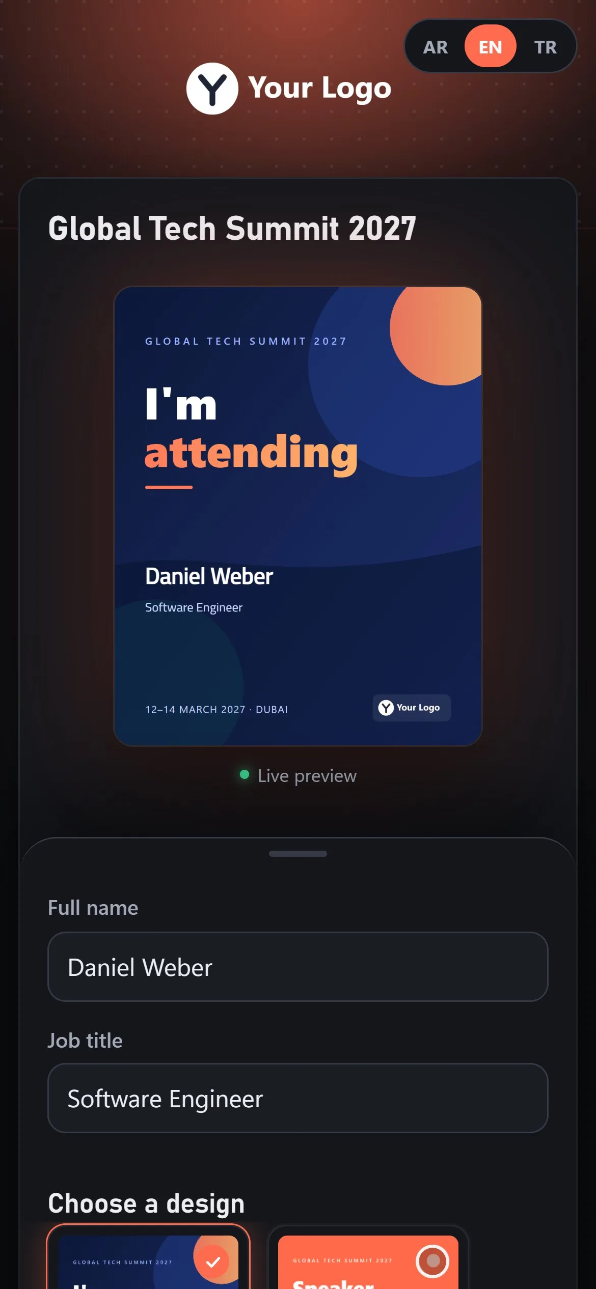
| Night | Dark page where the card changes while the participant types, with the designs and the buttons beside it |
Form from the fields. The form shows the event's open fields with their labels. The text box, social media and address fields may be left empty, and empty fields are not drawn on the card; the other fields are required.
Desktop layout. On a wide screen, the form and the card sit side by side.
Choosing a Design
Let participants compare every design with their own name on it.
When an event has several designs, "Choose a design" shows each of them with the participant's text already placed. The selected design becomes the large card.
Grid on desktop. Designs are shown in a grid of three columns, and four in the Night appearance.
One design, one step less. If an event has only one design, the design step is skipped.
Drawn the same way. Every design is drawn with the boxes, fonts and colors saved in the Template Editor.
Consent & Personal Data
Ask for contact details only with a clear choice.
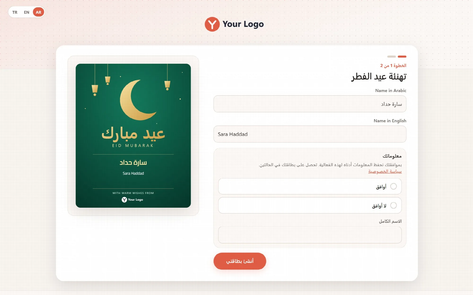
When an event collects data, participants must choose "I agree" or "I do not agree" before they make the card. The text above the choice explains what is kept and links to your privacy page.
I agree. The fields the event collects appear, for example the full name and the e-mail address, and they are required.
I do not agree. The e-mail and phone inputs are hidden, nothing is kept, and the participant still gets the card.
Kept only for a set time. Collected data is deleted automatically when the event's retention period ends.
Download & Sharing
Hand over the finished card the way each device works best.
The buttons follow the device the participant uses.
| Device | Buttons |
|---|---|
| Touch screen | Share (sends the card image) and Download |
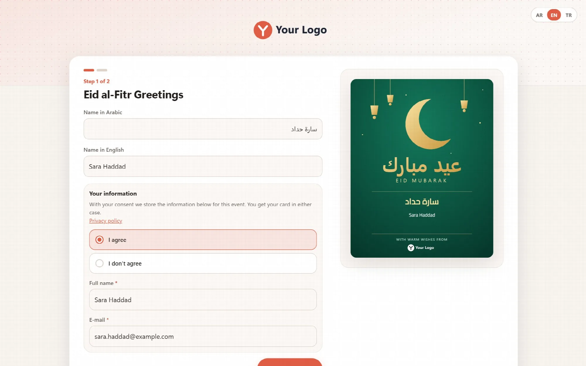
| Desktop | Download, Copy image, WhatsApp and E-mail |
Share text. WhatsApp and e-mail messages carry the event's share text, its hashtag and the public page link. A private link is never put into a shared message.
Only what works. Buttons the browser does not support stay hidden.
Made once. A card made once is reused for downloading, sharing and copying, so it is drawn and counted only once.
Readable file names. Downloads get a readable name and a short code that changes every time, for example ahmet-yilmaz-bayram-7f3a9c.png, in the design's real size.
Languages & Right-to-Left
Speak to each participant in their own language.
The AR / EN / TR switch changes the page language, and the Arabic page reads from right to left.
The choice carries over. The visitor's language choice also applies to the card, invitation and PIN pages. Without a choice, the page uses the event's language, then the installation's language.
Every script on the card. The card text is drawn in the participant's browser with the same rules as the editor, so Arabic letters join correctly and each box keeps its own direction.
Phones & Installable Page
Give participants a page that feels like an app on their phone.
The participant pages are built for phones first: the card, the form and the designs stack in one column.
Add to the home screen. The participant page can be installed as an app, with the app icon, name, colors and splash screen set on the PWA / Mobile App screen.
Always current. The installed page works online and always loads the current events and designs.
A Practical Participant Workflow
- Open the participant page or the event link the organizer shared.
- Choose the event and type the details in each field.
- Choose "I agree" or "I do not agree" if the event asks.
- Compare the designs and select the one you like.
- Download, copy or share the card.
Questions About the Participant Experience
Do participants need an account?
No. The participant page is public and needs no registration. The organizer decides which events are open.
Is the downloaded card the same as the preview?
Yes. The text is drawn with the same rules as the preview, and the download has the design's real size.
Can participants upload a photo?
No. Participants fill in the fields of the event; the design, the logo and the layout are set by the organizer.
Are previews counted as downloads?
No. Statistics count every download, also from participants who chose "I do not agree", but previews do not count.
Continue Your Cardix Workflow
Reviewed against Cardix 3.0.0 · Last updated 1 November 2026