ARN Smart

FULL-SCREEN INTRODUCTIONS ON ONE SHARED ENGINE

Hero Designs

Vendix Pro adds nine ARN Hero widgets to Elementor on WordPress: Story, Panels, Split, Typography, Sidebar, Fashion, Centered, Parallax and Editorial. Each design has its own panel and views, and all of them share one engine for keyboard and swipe navigation, right-to-left layouts, reduced motion and lazy-loaded media.

Shared Hero Engine

Get the same navigation, motion and loading rules in every design.

Every ARN Hero design is a separate Elementor widget with its own panel, views and styles, built on one shared engine. Switching designs changes the layout, not the way the slider behaves.

  • Keyboard. Arrow keys, Home and End move between slides once the widget has focus; left and right follow the reading direction.
  • Swipe and drag. Touch swipe and mouse drag change slides and are mirrored on right-to-left sites. Both can be turned off.
  • Autoplay you can stop. A play / pause button and a progress line appear while autoplay is on. Autoplay waits while the hero is hovered or focused, stays off for visitors who prefer reduced motion and stays off in the editor until you press play.
  • Lazy media. Images and videos of hidden slides load only when needed. A video plays only while its slide is shown, the widget is on screen and the browser tab is visible.
  • Page structure. Choose the title HTML tag (by default the first title is the H1 and the others H2), give the hero an accessible name and set a top offset when a transparent header sits over it.

Each slide takes an image or video background with a focal point and an overlay color, plus a subtitle, title, text and up to three buttons, depending on the design. The widget files load only on pages that use them, and ARN Hero widgets also start inside Full Modal content.

Design Suits Views
Story Processes told step by step 4
Panels Several offers side by side 4
Split Product launches 4
Typography One strong word per slide 4
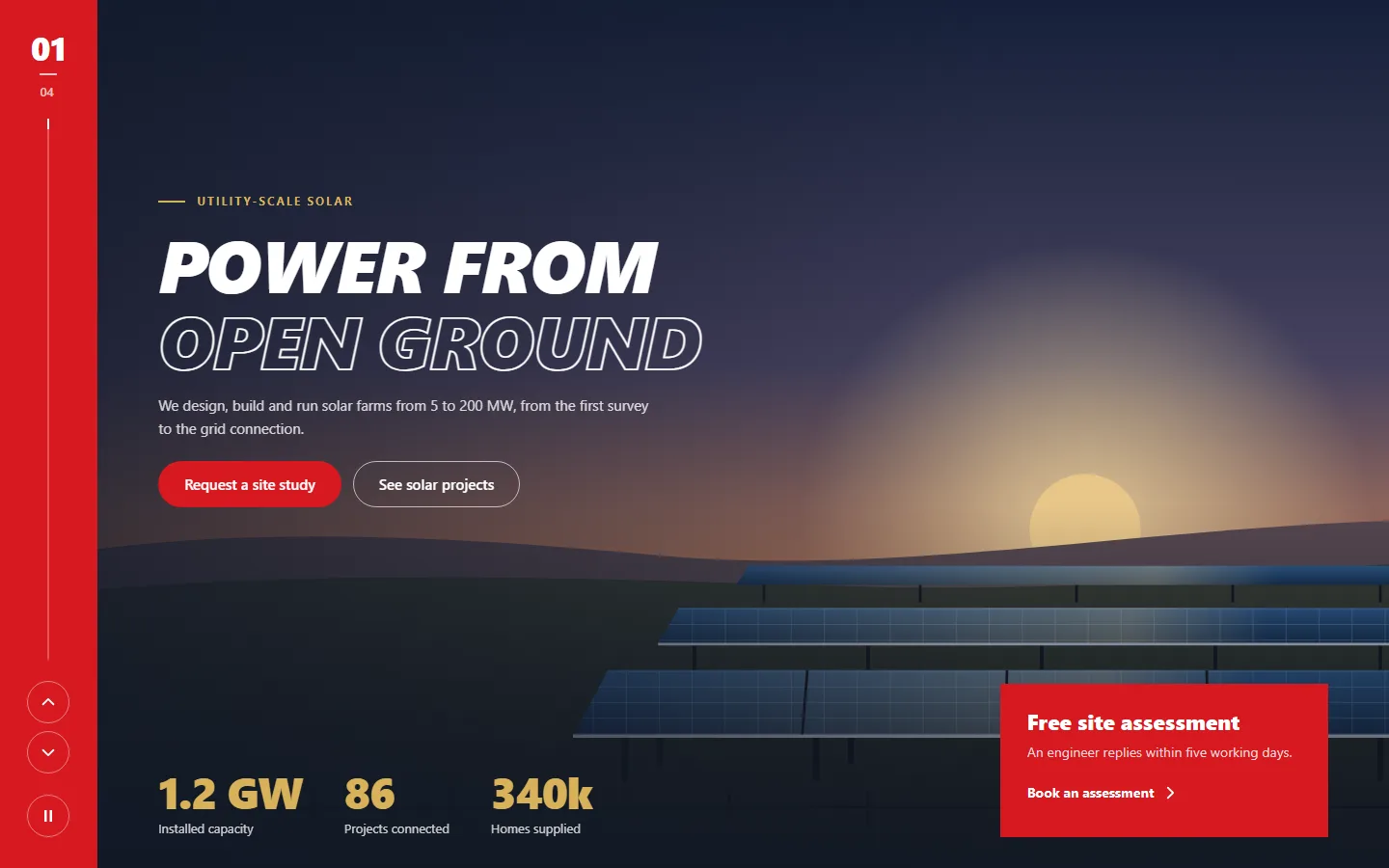
Sidebar Services with key figures 3
Fashion Collections and lookbooks 3
Centered Hospitality and brand introductions 3
Parallax Layered imagery with depth 3
Editorial Magazines and featured stories 3

The ARN Hero designs are part of Vendix Pro.

Story

Walk visitors through a process one step at a time.

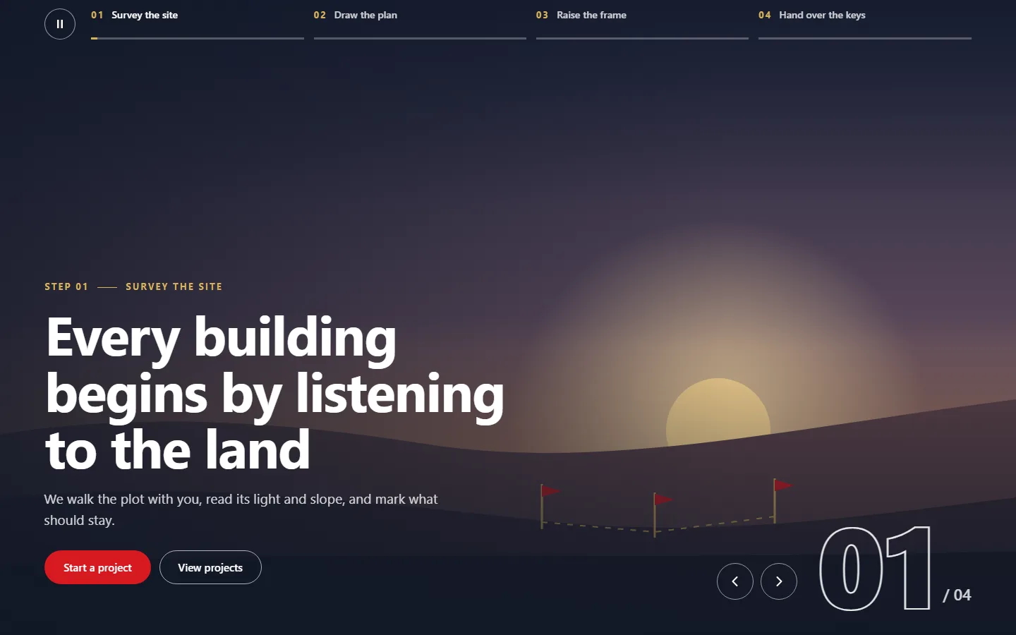
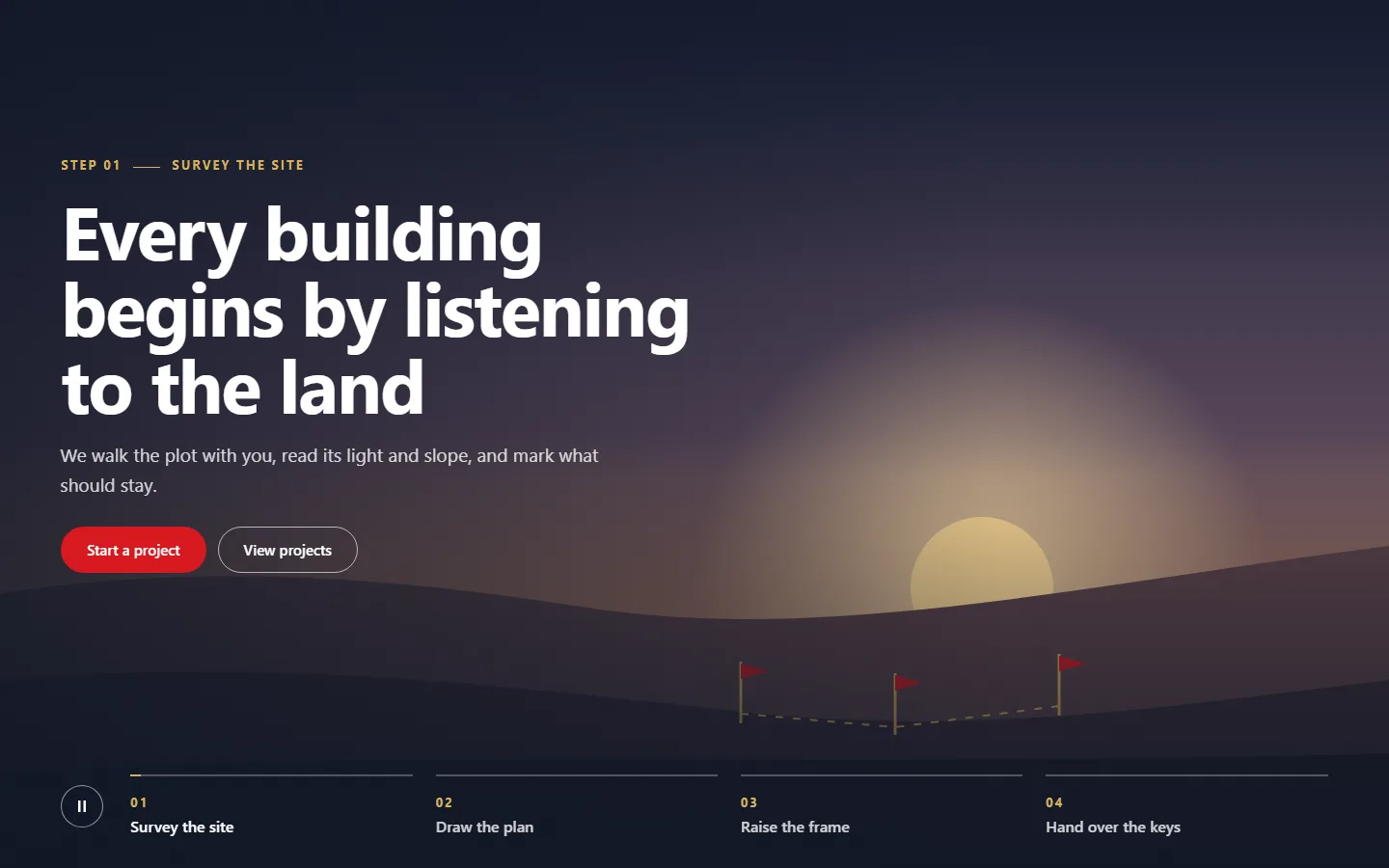
ARN Hero — Story is a full-screen step slider: each slide is a named step, shown in the navigation and above the title. Slides change with a fade, a slide or a zoom with Ken Burns, and an optional Ken Burns drift adds a slow zoom to the shown slide. Content sits at the start, center or end; centered content becomes a card over the media.

Views: step tabs along the bottom, steps in a side column, a numbered strip with a large counter, or a light panel beside the media.

Step navigation. Show step names or numbers only. On phones the steps show their numbers and the current step its name. Previous and next arrows and a step number above the title are optional.
Panels

Show three to six offers at once and let visitors open one.

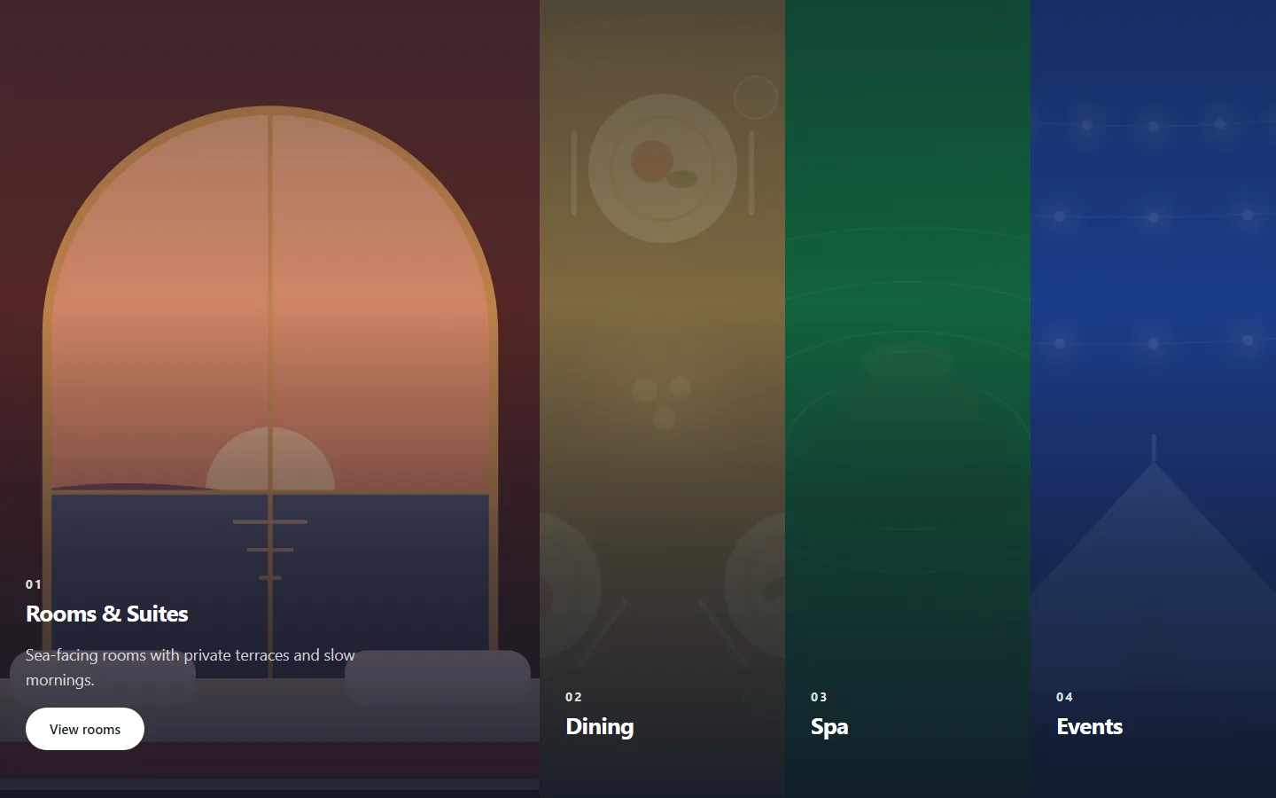
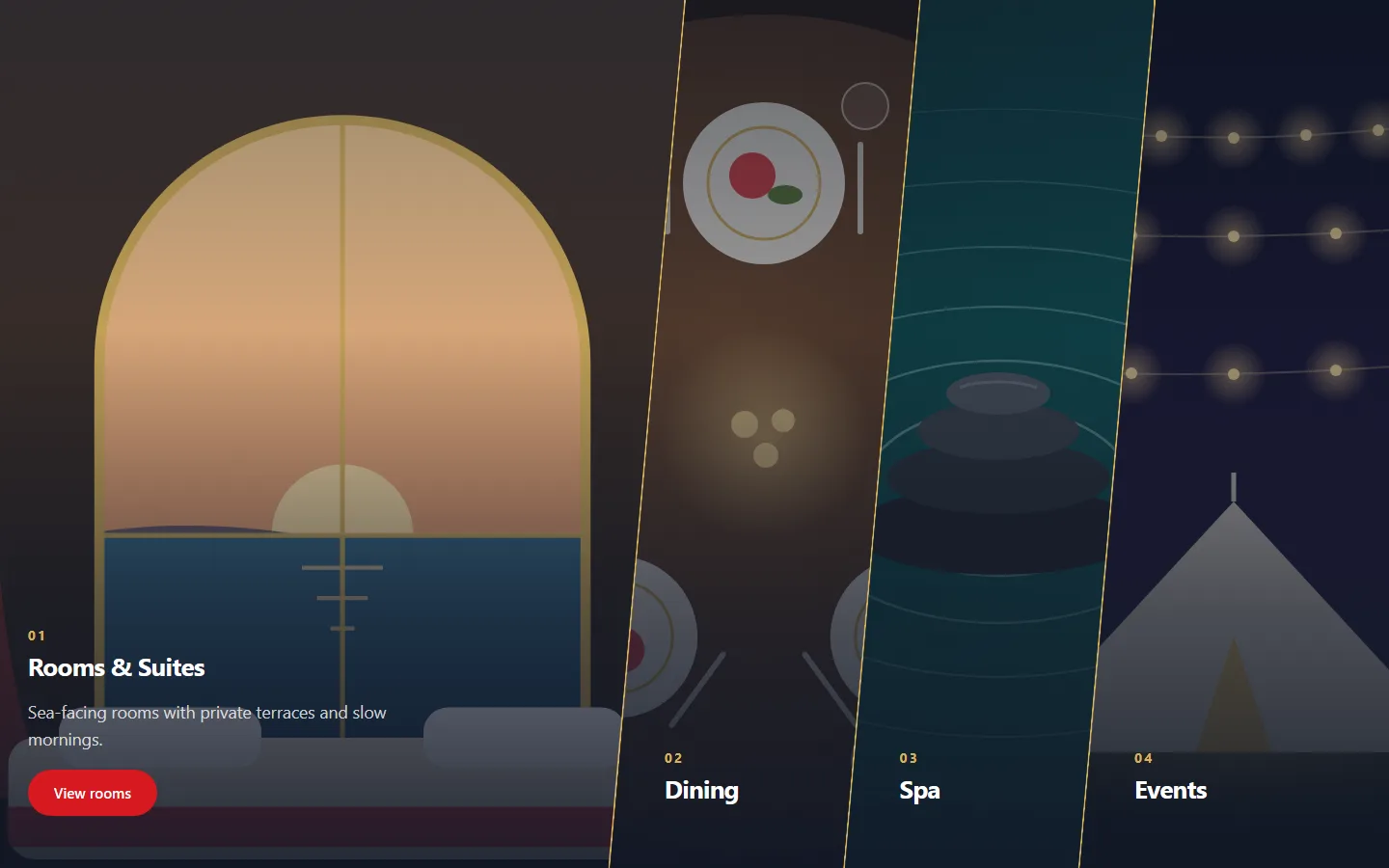
ARN Hero — Panels fills the screen with three to six panels that expand when opened. The first panel can be open at start, or all panels can start equal. A panel opens on mouse over, tap or click, or on tap and click only; touch screens and the keyboard work the same in both modes.

Views: slanted panels, straight panels, colour panels or stacked rows.

On phones and on tablets held upright, the panels become an accordion with one panel open. An optional rotation opens the panels in turn and has its own pause button. The slant, the dividers and the width of the open panel are adjustable.

Split

Put one product at the center of each slide.

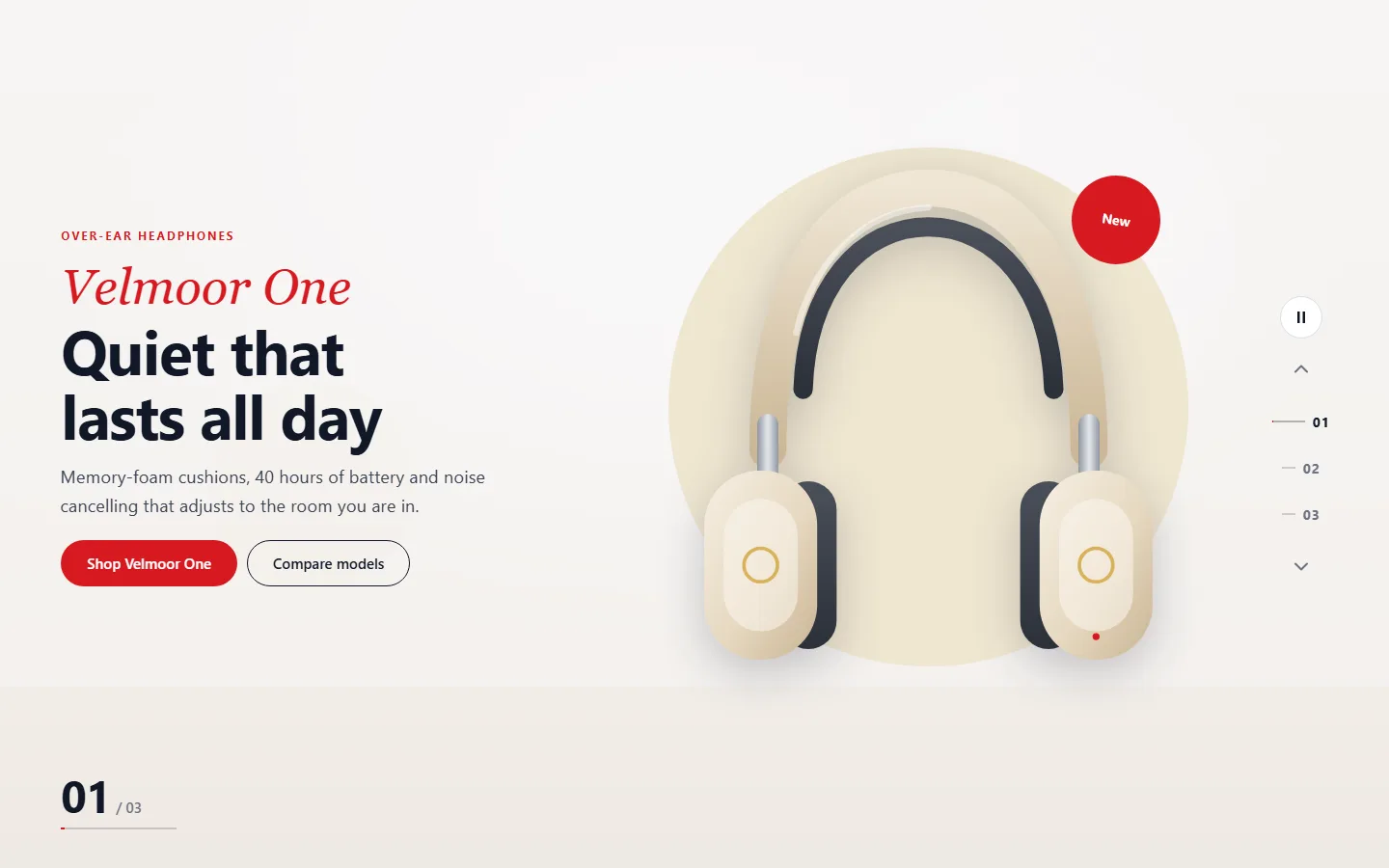
ARN Hero — Split is a product slider. Each slide has a cut-out product image (PNG, WebP or SVG with a transparent background), an optional round badge such as "New" and a two-typeface title. The first title line uses an accent style: serif italic, outline, light and spaced, or the title font in the accent color.

Views: text beside the product, two-tone with the product on the seam, product in front of an arch, or a dark showcase with a large number.

Navigation. Numbers with a line, dots or product thumbnails run down one edge on wider screens and along the bottom on phones. A slide number shows the autoplay progress. The product rises in, fades or slides in, and an optional floating motion moves it gently while it is shown (off for reduced motion). On phones the product sits above the text.

Typography

Build a slide around one large word.

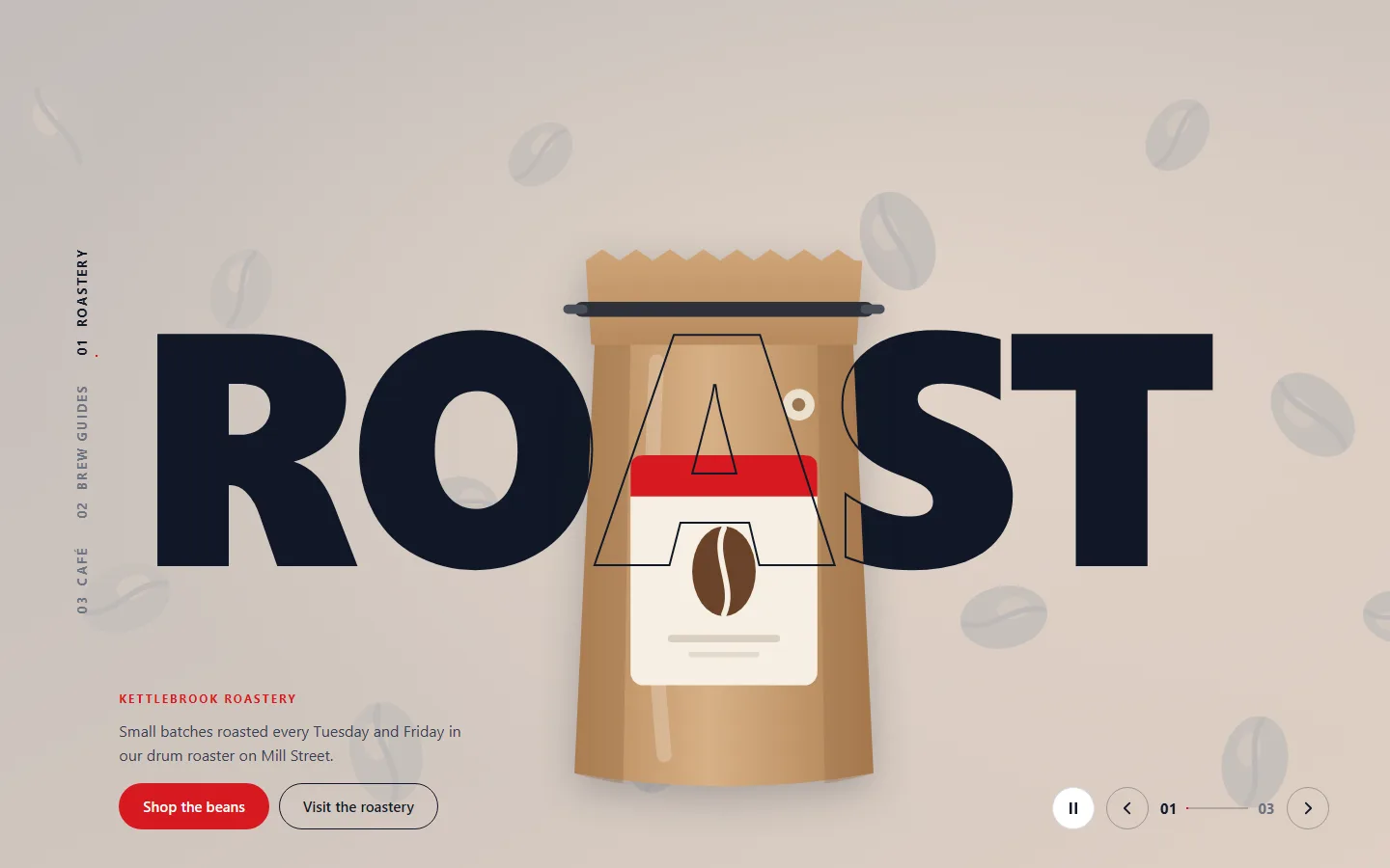
ARN Hero — Typography shows one big word per slide, sized to fill the width. An optional cut-out object can be woven through the word outline, placed in front of the word or behind it. Choose a light surface with a dark word or the reverse, solid or outline letters, and upper case or the case as typed.

Views: one word across the screen, stacked lines from the start edge, a moving band of the word, or the slide image inside the letters.

A side menu lists the slide names turned on their side; on phones it becomes numbers along the bottom. The moving band stops with the pause button, on hover and for reduced motion. The word rises in, fades in or zooms out as the slide changes.

Fashion

Present collections with their own navigation strip.

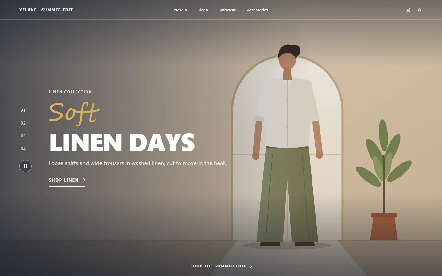
ARN Hero — Fashion is a collection slider with a thin top strip: a label, up to four collection links and social links from the widget or from Vendix → Company Data. The strip does not replace the site header. Each slide has a handwritten, outlined or serif italic accent line over a bold title, shop links shown as underlined links or buttons, and vertical slide numbers.

Views: full image under the strip, image in a light frame, or an arch image beside the text.

One bottom link stays on every slide. Slides change with a fade, a slide or a curtain reveal. The handwritten accent uses a script font from the visitor's system unless you choose a font under Style → Title.

Centered

Center the message and keep About and Contact one click away.

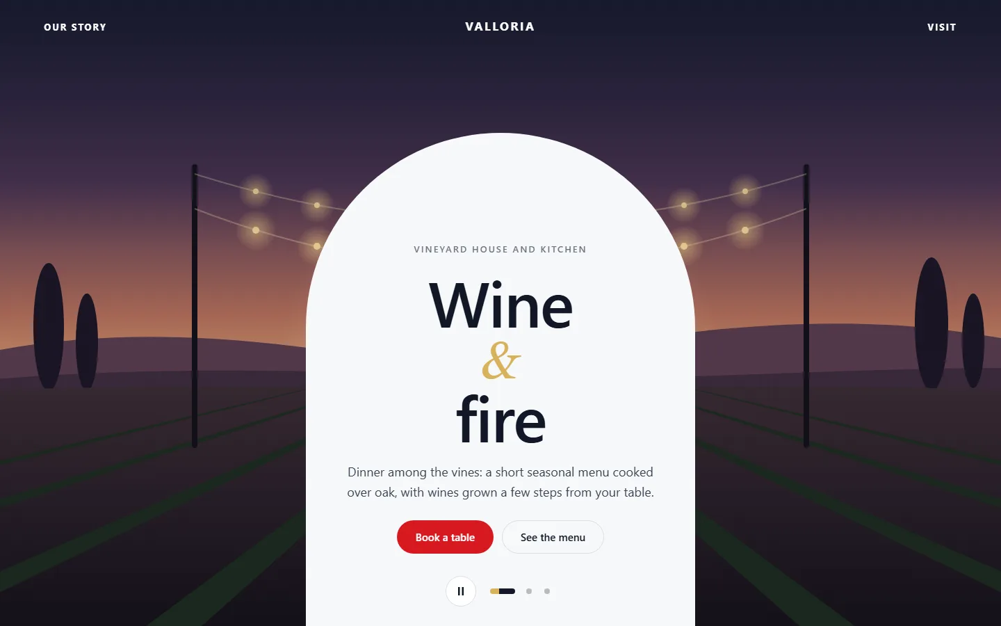
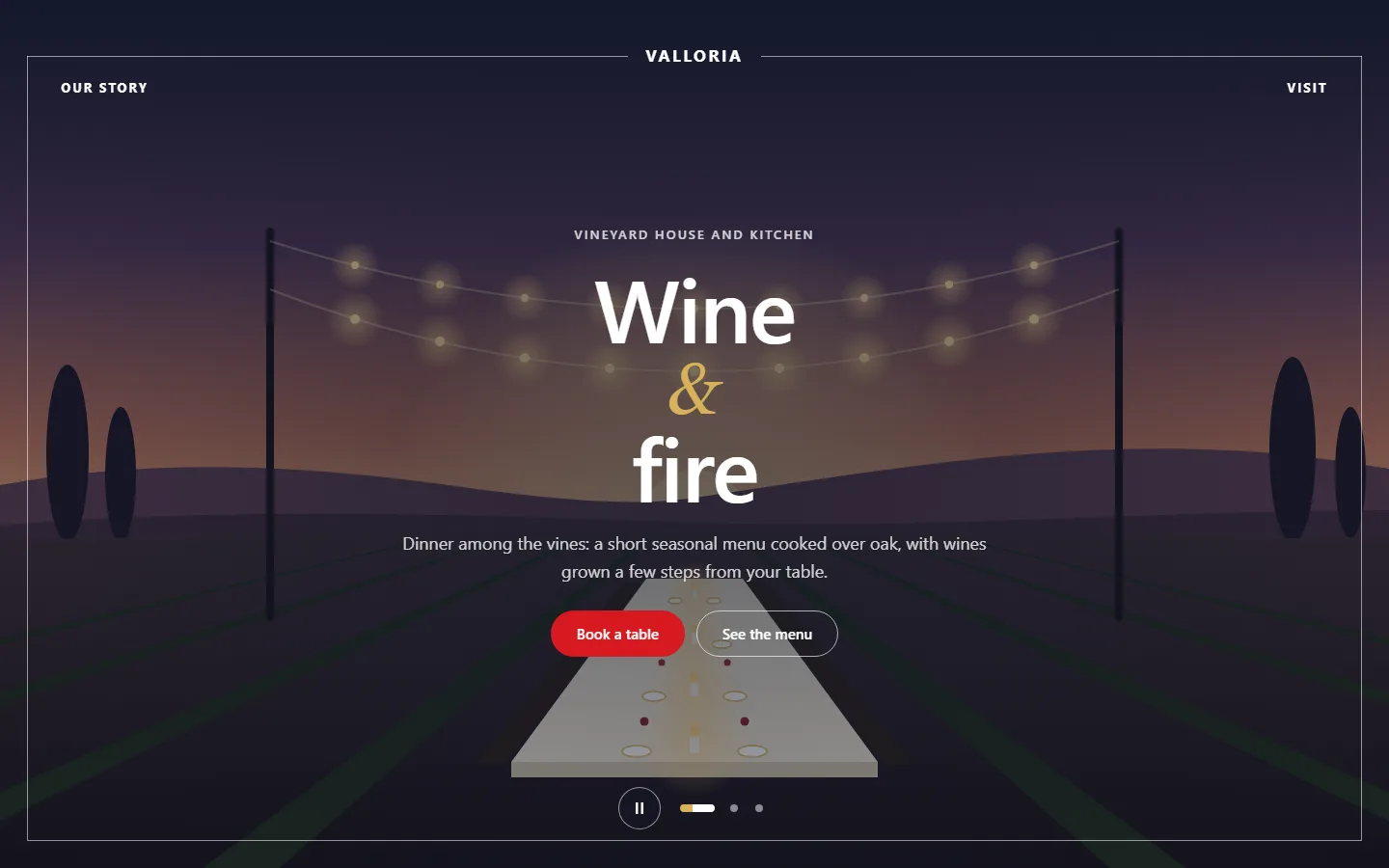
ARN Hero — Centered places the slide content in the middle. A title accent, a short word or sign such as "&", is set large in italics between the two title lines. A logo area at the top shows text (the site title by default) or an image (the site logo by default), and corner links such as About or Contact open side panels.

Views: thin frame over the media, light arch over the media, or a light page with an oval image.

Slide navigation uses dots, arrows at the sides, or both, and slides fade or zoom with Ken Burns. Choose None for the logo when the site header above already shows it.

Parallax

Give the slide depth that follows the pointer.

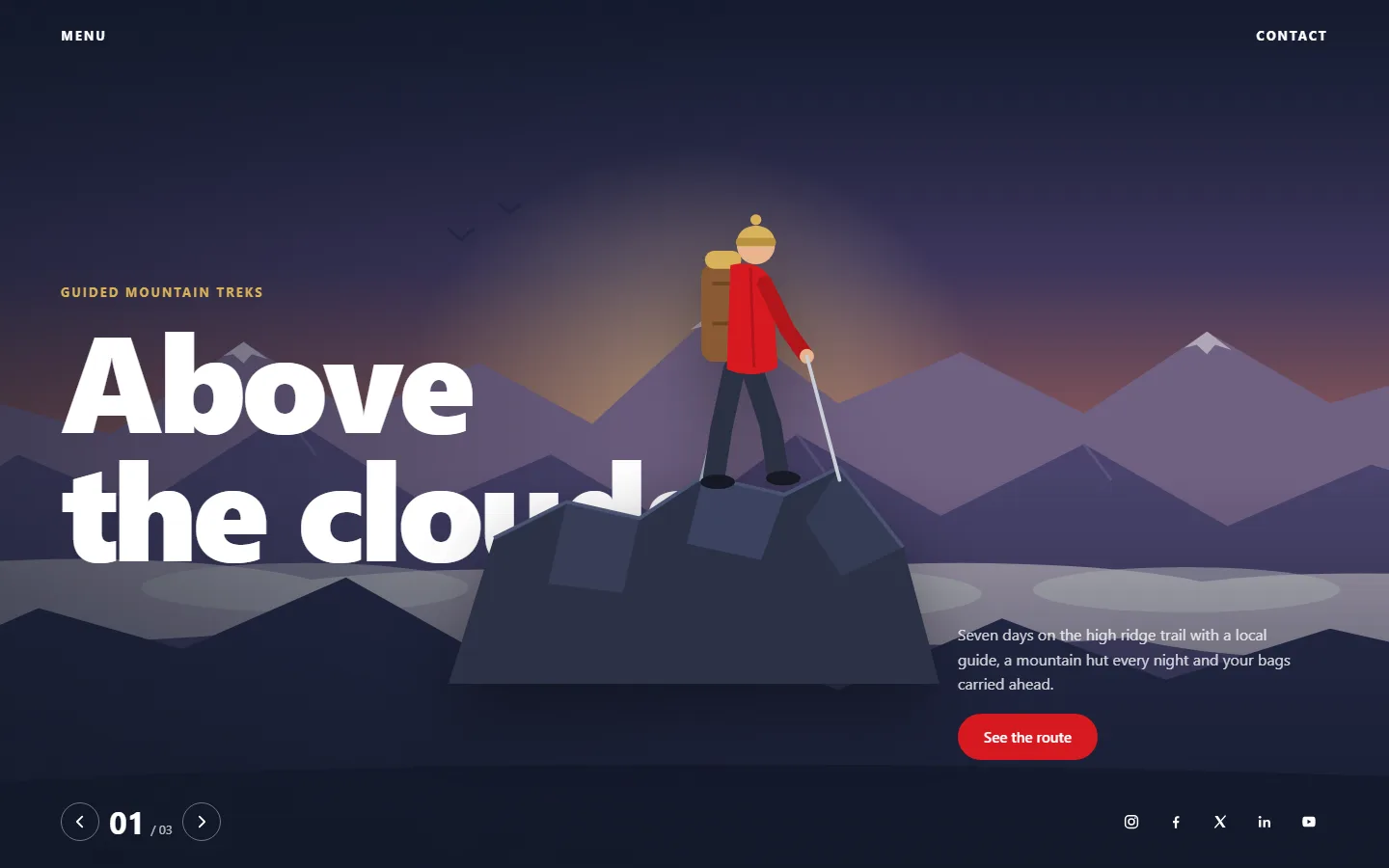
ARN Hero — Parallax combines a giant title with a cut-out image and background layers that follow the mouse at different depths. Touch screens and visitors who prefer reduced motion see the layers still. The corner interface holds a menu, a slide counter, social links from Vendix → Company Data and a contact link.

Views: layers over the media, a framed poster on a dark color, or a light page with a media panel.

Set the title side, the width of the cut-out image and the depth of the movement. A social network appears only when it has a profile address in Company Data.

Editorial

Lay out a featured story like a magazine cover.

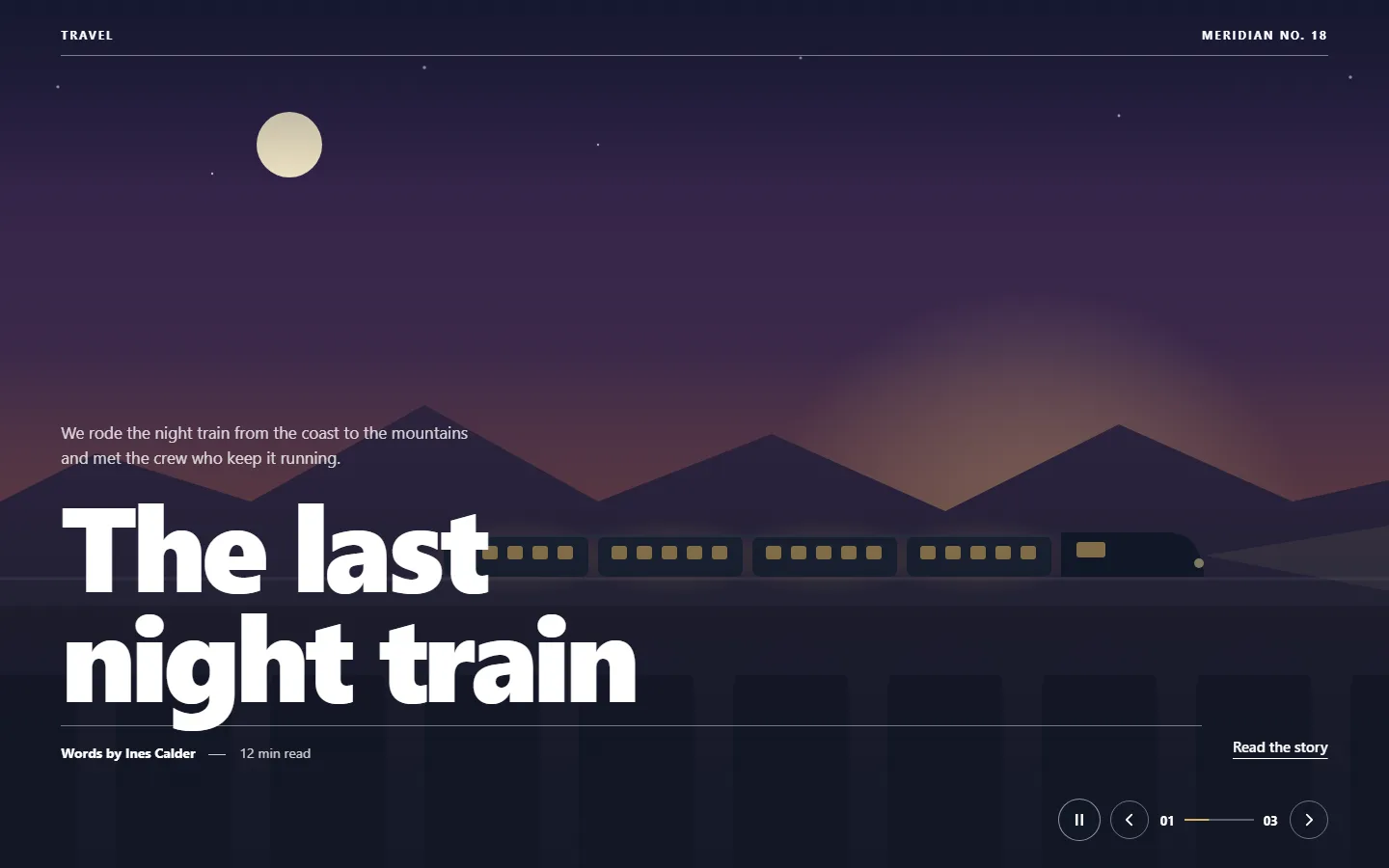
ARN Hero — Editorial uses two corner labels, such as a section name and an issue number, a giant title, a short text, an author line with a date or note, and a progress counter. Slides fade or wipe in the reading direction.

Views: magazine cover over the media, a text column beside the media, or framed media on a dark page.

Thin rule lines under the labels and above the author line have their own color, and the title width and page color are adjustable.

Hero Slider

Keep the original slider, now with drag and caption boxes.

The ARN Hero Slider widget stays in the collection beside the nine designs and has gained these controls:

  • Swipe and drag. Change slides by swiping on touch screens or dragging with the mouse, with a distance threshold and a quick flick, mirrored on right-to-left sites. Text stays selectable and links still open on a plain click. On by default; it can be turned off.
  • Caption box styles. Boxed, Glass, Outline, Band or Card behind the slide title, texts and buttons, with design-system colors, padding and radius. Each slide can choose its own style; existing heroes keep None.
  • Transitions. Slide and Reveal move in the direction of the change, also when wrapping around; Zoom fades the old slide out; text keeps 16 px clear of the side arrows; reduced motion shortens slide changes to 0.15 s.
  • First load animation. Fade up, Fade, Zoom or None for the first content once the slider appears on screen. The first slide image loads with high priority, and autoplay waits for the animation.
  • Button styles. The second and third buttons can have their own solid or outline style and colors.

The same First load animation setting is available in Image Slider, Logo Carousel, Testimonials, Media Showcase, Media Carousel, News Slider and Section Slider.

See the Shared Design Controls

Sample Content

Start from a finished example instead of gray placeholders.

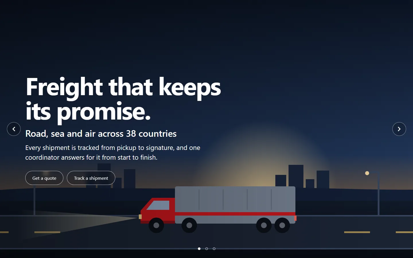
A newly dropped ARN Hero widget arrives with a complete made-up story and lightweight drawings shipped with the plugin. Replace the texts and images with your own; a slide added in the editor also starts with a drawing.

Design Sample story
Story An architecture firm
Panels A seaside hotel
Split An audio brand
Typography A coffee roastery
Sidebar A renewable energy firm
Fashion A summer clothing collection
Centered A vineyard house and kitchen
Parallax A mountain trek company
Editorial A magazine

Widgets already saved on a page keep their texts and settings. In ARN Hero Slider, Image Slider, Logo Carousel and Media Showcase, saved items that still used Elementor's gray placeholder image show the sample drawing instead.

A Practical Hero Workflow

  1. Pick the design whose layout matches the message: steps, offers, a product, a word, figures, a collection, a centered brand, depth or a story.
  2. Drop the widget and compare its views with the sample slides before replacing anything.
  3. Add your texts, images or videos, set focal points and choose the title HTML tag for the page outline.
  4. Set the transition, autoplay and navigation, then add corner links if visitors need About or Contact details.
  5. Check desktop, phone, right-to-left and reduced-motion output before publishing.

Questions About Hero Designs

Are the nine hero designs separate widgets?

Yes. Each design is its own Elementor widget with its own panel, views and styles. Navigation, autoplay, media loading and corner links come from the shared engine.

Do the hero designs work on right-to-left sites?

Yes. Arrow keys, swipe, Start and End positions and corner placements follow the reading direction, so a right-to-left page gets a mirrored layout. Arabic titles get no extra letter spacing.

Will existing heroes change after the update?

Existing ARN Hero Slider widgets keep their look: caption boxes start at None and saved slides keep their texts and settings. Only items that still used Elementor's gray placeholder image now show a sample drawing.

Can a hero slide play video?

Yes. A slide can use a Media Library video or a video file URL, with the slide image as its poster. The video plays only while its slide is shown and the widget is on screen.

Are the hero designs included in Vendix Free?

No. The ARN Hero designs are part of Vendix Pro; the Free edition has 15 other widgets.

Reviewed against Vendix Pro 1.11.0 · Last updated 20 October 2026