

A COORDINATED COLLECTION FOR THE SECTIONS YOUR WEBSITE NEEDS
Elementor Widgets
Vendix provides 117 Elementor widgets for WordPress: 61 core widgets for content, media, navigation, pricing, trust and dynamic sections, nine ARN Hero designs, seven template widgets, ten optional Newspaper widgets, ten WooCommerce module widgets and 20 store page widgets for Vendix templates. This page groups them by purpose and describes their shared design controls.
| Group | Widgets | Needs |
|---|---|---|
| Core widgets | 61 | Elementor; ARN Banner also needs the Banners module |
| Hero designs | 9 | Elementor |
| Template widgets New | 7 | Elementor |
| News publishing | 10 | Elementor and the Newspaper module (Smart Features → Newspaper Widgets) |
| WooCommerce | 10 | Elementor, WooCommerce and the widget's store module (Vendix → WooCommerce) |
| Store page widgets New | 20 | Elementor and WooCommerce; listed in the editor of a Vendix template of their type |
Content & Layout
Give information a clear structure.
Use headings, lists, cards, FAQs and timelines to turn a long message into understandable sections. Vendix's content widgets help you establish hierarchy, connect an explanation with an action and reuse a saved layout where it fits.
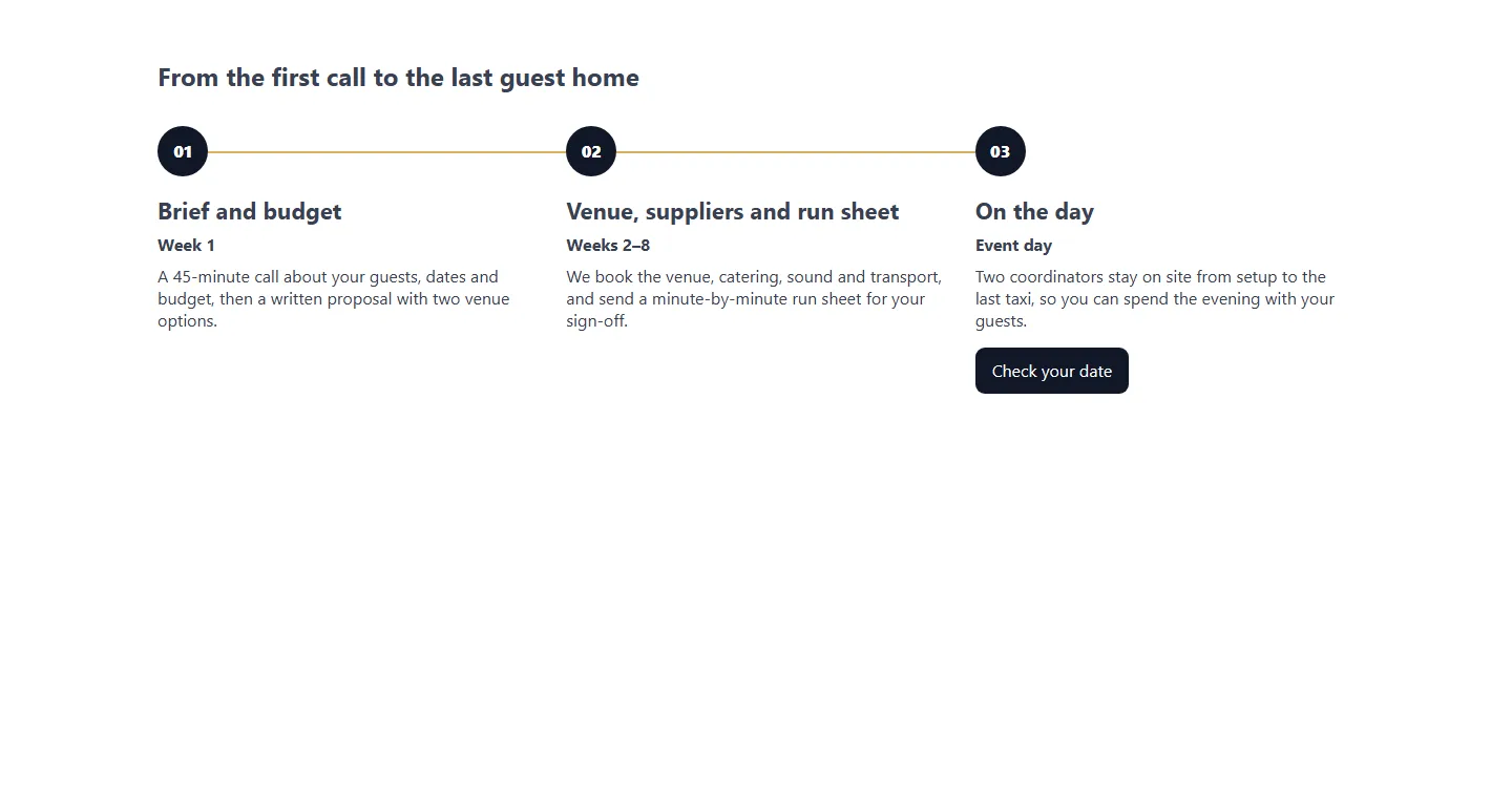
Included widgets: Advanced Heading, Icon Heading, Smart Text Editor, List Block, Feature Block, Info Box, FAQ, Process / Timeline, Shape Divider, Template, Notice New, Unfold New, Highlights New and Review Box New.
Choose the component's purpose before choosing its decoration. Use headings for structure, list blocks for parallel points and an FAQ for questions that genuinely need separate answers.
- Layer headings and supporting text through the available controls. Advanced Heading adds gradient, image or video fill, stroke, background text, reveal, shimmer and rotating-word effects, plus drawn highlight shapes.
- Present compact feature lists or larger information blocks. Info Box, Feature Block and Icon Heading accept Lottie and drawn SVG icons. List Block, Info Box and Contact Cards offer design presets such as Cards, Filled and Person Cards, and Info Boxes in one row can keep an equal height and show their link as text or as a button.
- Notice: show information, success, warning or error messages in four looks (side stripe, filled, outlined, plain). Colors come from the design system's status colors, warnings and errors are read out to screen readers as alerts, and visitors can optionally close a notice and keep it closed.
- Unfold: fold long text or an Elementor template to a set height with a "Read more / Show less" button and an optional bottom fade.
- Highlights: a row of story circles, each opening up to five full-screen cards for a campaign, a post, a page or a product. Product cards add to the cart without leaving the page, seen circles get a grey ring, and the viewer loads only when a visitor first reaches for a circle.
- Review Box: the review of a post with the reviewed item, an overall score on a scale of 5, 10 or 100, criteria, pros and cons and a summary. The post adds a Review node to the Vendix structured data where the box is shown. See Post Features
- Reuse Elementor templates without rewriting their content.
Images & Media
Show the visual detail that supports the message.
A product gallery, an interactive comparison and a full hero have different jobs. The media collection provides components for those uses, with responsive presentation controls appropriate to each widget.
Included widgets: Hero Slider, Image Slider, Responsive Image, Edge Image, Before / After, Hotspot Image, Split Image, Interactive Image Card, Media Showcase, Media Grid New, Media Carousel New and Lottie New.
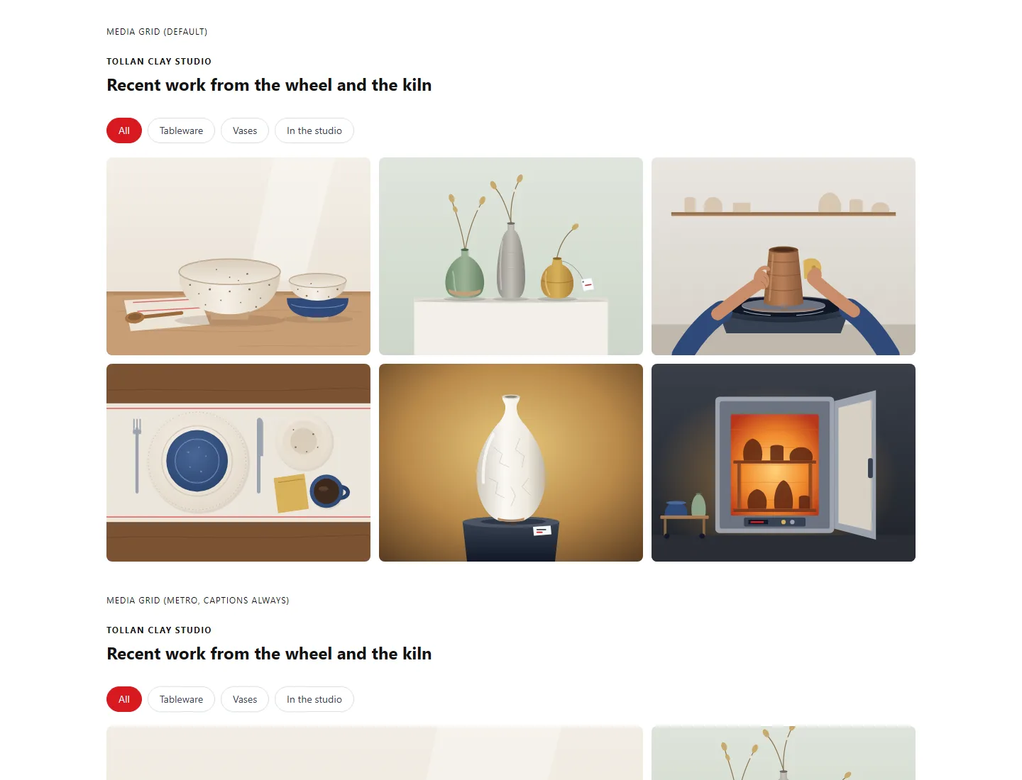
- Media Grid: show images and videos from a manual list, a WordPress gallery or a WebPix folder (when WebPix is active) in grid, masonry, metro or justified layouts, with category filters, "Load more", captions, hover effects and the Elementor lightbox (YouTube privacy mode, Vimeo "do not track"). Untitled items never show their file names; the "Items without a title" option, also in Media Carousel, sets how they are captioned.
- Media Carousel: combine image, video, Elementor template and page-container slides; move them step by step, as a continuous flow, as a coverflow or with a flip, horizontally or vertically.
- Lottie: play
.jsonand dotLottie (.lottie) animations with loop, speed, hover, click, scroll and in-view triggers. The player loads only when an animation comes into view, and uploads are limited to 5 MB. - Interactive Image Card: square and circle shapes and effects such as flip, doors, sliding panel and curtain; on phones and touch screens the text stays visible.
Use a responsive image when device-specific composition matters. Use hotspots to explain selected points, and before/after views when the comparison itself is useful. Keep interactive effects secondary to the content and test the resulting layout on touch screens. ARN Hero Slider now supports swipe and drag and caption box styles; see Hero Slider.
Hero Designs
New
Open the page with a full-screen introduction built for its message.
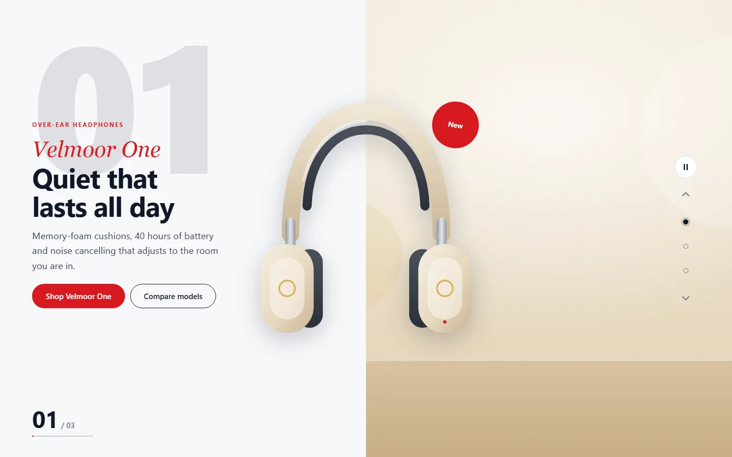
Nine ARN Hero widgets cover different introductions. Each design is its own widget with its own panel and views, and all of them share keyboard and swipe navigation, right-to-left mirroring, reduced-motion handling and lazy media for hidden slides.
Included widgets: ARN Hero — Story, Panels, Split, Typography, Sidebar, Fashion, Centered, Parallax and Editorial.
- Story and Panels: step-by-step slides, or three to six expanding panels that become an accordion on phones.
- Split, Typography and Fashion: a cut-out product beside a two-typeface title, one large word per slide, or a collection slider with its own top strip.
- Sidebar, Centered, Parallax and Editorial: a side bar with key figures, a centered message with a logo area, pointer-driven layers, or a magazine-style cover.
Corner links can open a side panel or a modal with text or a saved Elementor template inside any ARN Hero widget.
Navigation & Interaction
Help visitors find the next section and the next action.
Included widgets: Advanced Tabs, Section Tabs, Section Slider, Modal / Popup, Full Modal, Icon Menu, Navigation Menu, Header Search, Header Tools, Site Logo, Table of Contents and Breadcrumbs.
The Navigation Menu widget supports Header Menu and Inner Page Menu within the same component. Select a WordPress menu or custom links, choose from ten item styles, and set normal, hover and active presentation. Line/border color and thickness are configurable.
For an inner menu, choose horizontal scrolling, wrapping or a menu button when items do not fit. Both menu types can be horizontal or vertical, set separately for desktop, tablet and phone. Active-page handling follows supported matching rules; in-page anchors are not presented as separate current pages.
A modal can open automatically after a delay, on scroll, on exit intent or after inactivity, every time, once per session or once every N days, and a click on an ARN Lottie animation can open it too. Section Tabs and Advanced Tabs offer a two-option Switch layout, Header Search has an icon-only option, and Breadcrumbs can add steps after Home or build a fully custom trail. On product and shop pages, Breadcrumbs shows WooCommerce's own trail: the product categories of a product and the shop page of a product search.
Use modals for focused content and tables of contents for long pages. Review keyboard, mobile and cache behavior alongside the visual design.

Pricing & Conversion
Make choices easier to compare.
Included widgets: CTA, ARN Button, Pricing Table, Plan Comparison, Comparison Table, Price Box, Pricing Cards, Countdown and ARN Banner New.
Show plan differences in a comparison, use a price box for product details, and keep the primary action visible beside the information supporting it. Countdown output can represent an actual scheduled event; it should not imply an invented deadline. On phones, a Comparison Table either scrolls sideways or shows one card per row, as set by its Mobile Layout option.
ARN Banner places a banner zone or a single banner from the Banners module. The zone sets the size per device, the format (in the page, pop-up, slide-in or bar), the rotation and where it may show. The module is off by default; turn it on in Smart Features → Banners.
The widgets provide presentation controls, not a promise of conversion improvement. Supply accurate plan information, prices and destinations, then review the customer journey on desktop and mobile.

Trust & Business
Bring people and business details into the page.
Included widgets: Logo Carousel, Testimonials, Team Members, Floating Contact, Contact Cards, Get in Touch, Business Hours and Company Information.
Present real customer feedback, relevant team profiles and current contact details. Supported company-data connections let repeated phone numbers, locations and opening information use the centrally maintained record. Each contact card can have its own button text and link, separate from the map link, and Team Members uses one photo ratio for every card and shows department filter buttons only when you turn them on.
Contact components can make the next step easier to find without requiring every destination to be entered again. Use the available settings to match placement and presentation to the page. While the Visioix contact widget is on, the ARN Floating Contact widget stays hidden on the live site; the editor still shows it with a note.

Dynamic Content
Keep moving content useful and readable.
Included widgets: Post / Content Grid, Content Ticker, Marquee, Counter, Progress Bar and World Clock New.
Use a content grid to browse published entries, a ticker for short updates and numeric components for meaningful values. Movement can help draw attention, but the content should remain understandable without relying on animation alone.
- Post / Content Grid: show the latest content or hand-picked posts, pages and other content in the order you set, with optional category filter tabs that load without a page reload, page numbers next to "Load More" and an adjustable empty-state message. Editors see draft and scheduled items in the editor and previews; visitors see published content only. Cards can show a topic label taken from the entry's category.
- World Clock: show digital or analog clocks for any time zones, in 12- or 24-hour format, with optional seconds, date and a day/night mark.
Choose the supported source, ordering and display controls for the component. Check long titles, empty results and mobile layouts before extending the design across the website.

News Publishing
Build publication sections from the content you already maintain.
Enable the optional Newspaper module in Smart Features → Newspaper Widgets to add the ARN Newspaper Widgets group in Elementor. Ten components cover a news or magazine site:
- Section Header: introduce a section with supported heading styles, category links or custom destinations.
- News Blocks: arrange lead stories, grids, lists and mosaics through 11 layouts and seven item styles; pin a post first or show a Banners zone after every few items.
- News Slider: present headlines through five layouts, with navigation, pause and interaction controls.
- Popular / Tabbed News: switch between latest, most-read, most-commented, featured or category views.
- Authors: present author profiles, biographies, counts and recent posts.
- News Ticker: show short updates from posts or a block-editor page.
- Related News, Reading Time & Share Bar, Recent Comments and Social Counter: New add related stories, reading time with share buttons, the latest reader comments and follower counts that you enter by hand (nothing is requested from the networks).
Shared post settings include categories, tags, authors, selected content, sorting and time windows, with duplicate exclusion across the page. While no published post matches, the editor shows a sample local paper with a note; visitors see nothing. The module displays existing published content; it does not scrape external news or write articles automatically.

WooCommerce Widgets
New
Place store features exactly where the product page needs them.
The WooCommerce widgets appear in Elementor when WooCommerce is active and their store module is turned on under Vendix → WooCommerce. Every store module is off until you turn it on.
| Widget | Store module | Purpose |
|---|---|---|
| ARN Bundle Contents New | Product Bundles | Lists the products inside a Vendix Bundle |
| ARN Product in Bundles New | Product Bundles | Shows the bundles a product belongs to |
| ARN Smart Product Buttons New | Quick Buy Buttons | Buy now, WhatsApp and marketplace buttons |
| ARN Size Chart New | Size Charts | The product's size chart as a "Size guide" link or a table |
| ARN Frequently Bought Together New | Smart Recommendations | Products bought together in real orders |
| ARN Similar Products New | Smart Recommendations | Products with shared attributes, tags and categories |
| ARN Recently Viewed New | Smart Recommendations | Products the visitor viewed, kept in the browser |
| ARN Review Gallery New | Photo & Video Reviews | Approved customer photos and videos |
| ARN Loyalty Points New | Loyalty Points | What a product earns and the customer's balance |
| ARN Order Tracking New | Shipment Tracking | A form for the order number and billing email, then the order's shipments |
Explore Bundles & Quick Buy · Explore Cart, Delivery & Stock · Explore Reviews, Loyalty & Recommendations · Explore Shipment Tracking

Template Widgets
New
Build theme templates from parts made for them.
Template widgets draw the parts of posts, archives and store pages inside Vendix Templates.
Post and archive widgets (7). ARN Post Content, Post Meta, Author Box, Post Navigation, Comments, Archive Posts and Pagination sit in the ARN Smart Widgets group and also work on any page that shows a post or a list.
Store page widgets (20). While WooCommerce is active, the Elementor panel lists them only in the editor of a Vendix template of their type: the product and shop widgets in ARN Smart Widgets, the cart, checkout, order received and account widgets in their own ARN Store Pages group:
| Page | Widgets |
|---|---|
| Product | Product Gallery, Add to Cart, Product Tabs, Product Meta, Store Notices, Product Hooks, Linked Products, Delivery Estimate |
| Shop and product lists | Products, Product Filter |
| Cart and checkout | Checkout Steps, Free Shipping Bar, Trust Badges |
| Order received | Order Status, Order Summary, Order Items, Order Addresses, Order Extras, Create Account |
| My account | Account Navigation |
The store page widgets print WooCommerce's own gallery, forms, tabs and order blocks, so variations, payments and the parts of other plugins keep working.

Design Controls
Adapt components while keeping the site recognizable.
Supported widgets share responsive typography, spacing, color, alignment and interaction-state controls. Widget colors follow the design system palette, including four status colors for information, success, warning and danger.
- Sample content. A widget dropped on a page arrives with a finished made-up example: one invented business per widget, texts that belong together and light drawings shipped with the plugin, instead of gray placeholders. Widgets saved earlier keep their content and look, also when they are opened and saved again in the editor.
- First load animation. Hero Slider, Image Slider, Logo Carousel, Testimonials, Media Showcase, Media Carousel, News Slider and Section Slider bring in their first content with Fade up, Fade, Zoom or None once they appear on screen, without layout jumps. Visitors who prefer reduced motion see it without movement.
- Right-to-left layouts. Alignment controls that follow the reading direction are labeled Start and End, and arrows, keys and swipe gestures are mirrored on right-to-left sites. See Languages & RTL
- Container effects. Elementor containers can use animated shape dividers from a 25-shape library and an ARN Animated Background with eleven effects: Fog, Waves, Clouds, Clouds 2, Topology, Cells, Animated Gradient, Aurora Gradient, Flow Field, Ken Burns and a Lottie animation. Each has an opacity setting, mouse and touch interaction and a phone switch that is off by default. The animation libraries load only when the container approaches the screen and not at all for visitors who prefer reduced motion; use one Canvas or WebGL background per page.
- Animated buttons. The content buttons of Hero Slider, CTA, Advanced Heading, Feature Block, Image Slider, Pricing Table, Plan Comparison, Process / Timeline and Business Hours can carry a light CSS background effect, such as Mosaic Grid, Dot Field, Light Sweep or Gradient Mesh, always on or only on hover and focus.
- Linked templates. New In the Elementor editor's context menu, "Vendix: Convert to linked template" saves a widget or container as an Elementor template and puts an ARN Template in its place, so several pages share one copy. "Vendix: Edit template" opens it, and "Vendix: Detach from template" brings the content back as a normal copy.
- Stay in view while scrolling. New An Elementor container can keep itself in view while the page scrolls (Advanced → Vendix), for example a product summary beside a long image grid.
Use the shared design system for the project baseline and individual widget controls where a component needs an exception. Elementor element-level typography retains priority within the documented design scope.
For complete ready-made Elementor sections, use the Section Library.

Build One Representative Section First
Choose a component by its purpose.
Review its sample content, then configure its content source and destinations.
Review desktop, tablet and mobile output.
Test interaction and dynamic values.
Reuse the pattern where it fits.
Questions About Widgets
How many widgets does Vendix Pro include?
Vendix Pro includes 117 Elementor widgets: 61 core widgets, nine ARN Hero designs, seven post and archive template widgets, ten Newspaper widgets that appear when the module is enabled, ten WooCommerce widgets that appear when WooCommerce and their store modules are on, and 20 store page widgets for Vendix templates. The independent Header & Footer Builder is a separate tool outside this count.
Do all widgets belong to the Free edition?
No. Free contains 29 widgets, among them the Section Header, News Blocks and News Ticker news widgets. Everything else on this page, including the hero designs, the template widgets, the other Newspaper widgets and the WooCommerce widgets, is part of Pro. Check the edition and enabled modules for the component you intend to use.
Will sample content replace what is already on my pages?
No. Sample content appears only when a widget is newly dropped on a page. Widgets saved earlier keep their content and look, also after they are saved again in the editor.
Why does a WooCommerce widget not appear in Elementor?
Each WooCommerce widget belongs to a store module that is off until you turn it on under Vendix → WooCommerce. WooCommerce must also be active. The store page widgets appear only while you edit a Vendix template of their type.
Does the Newspaper module write news articles automatically?
No. The module displays existing published content; it does not scrape external news or write articles automatically. Enable it in Smart Features → Newspaper Widgets to register the ten publishing widgets.
Reviewed against Vendix Pro 2.0.0 · Last updated 28 October 2026